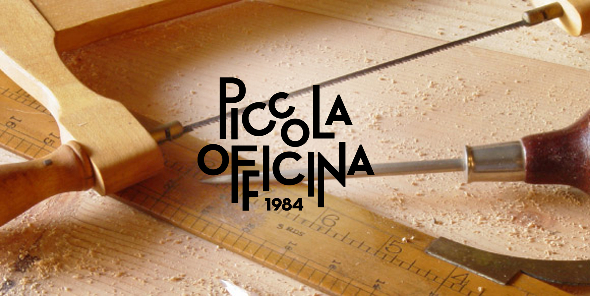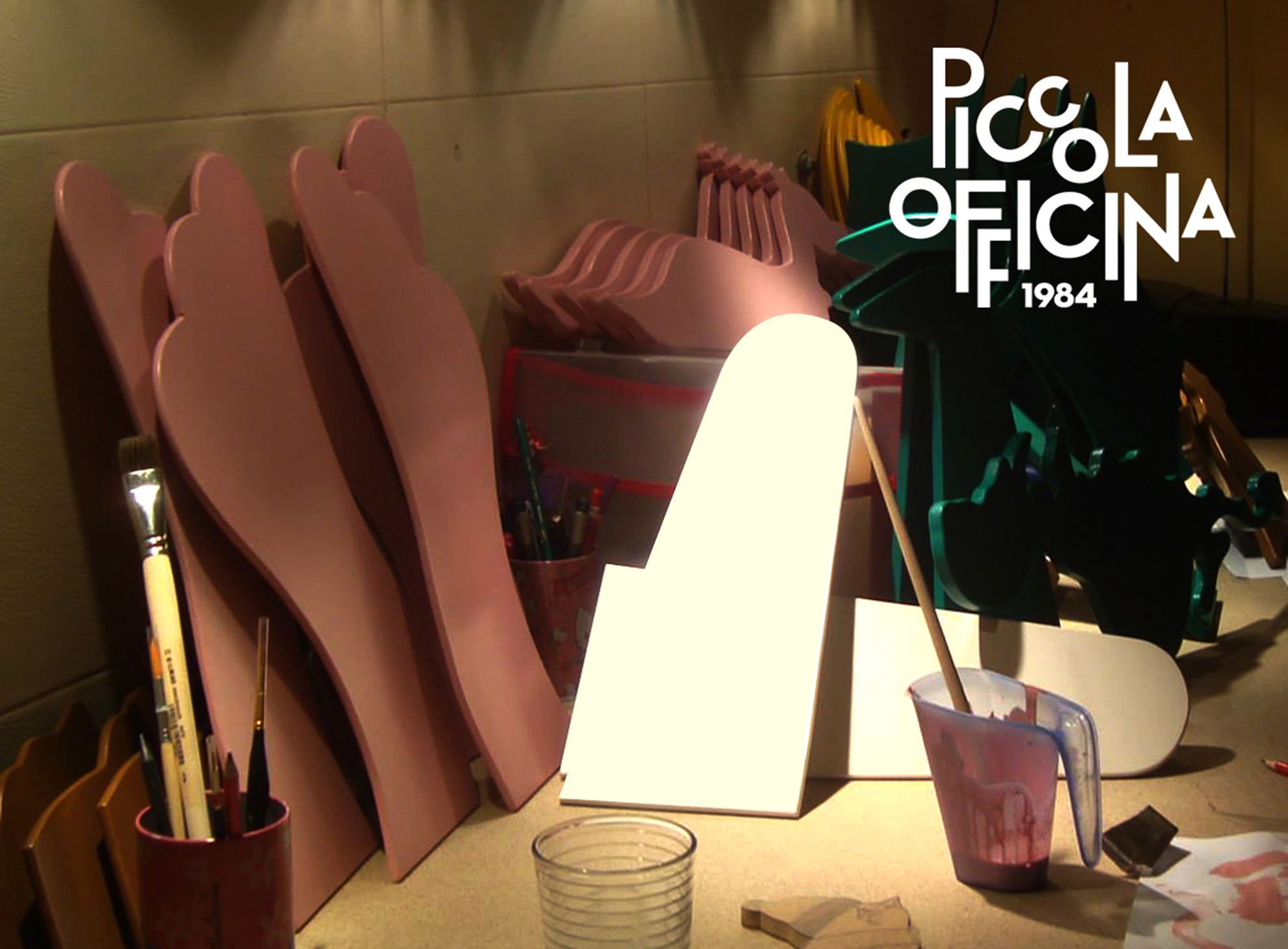
We had the opportunity to create the visual identity for a new and fresh company designing and producing small wooden toys for children.
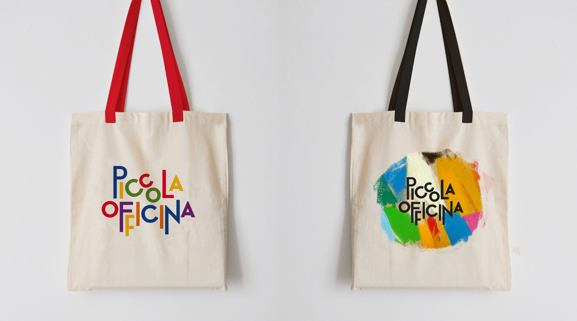
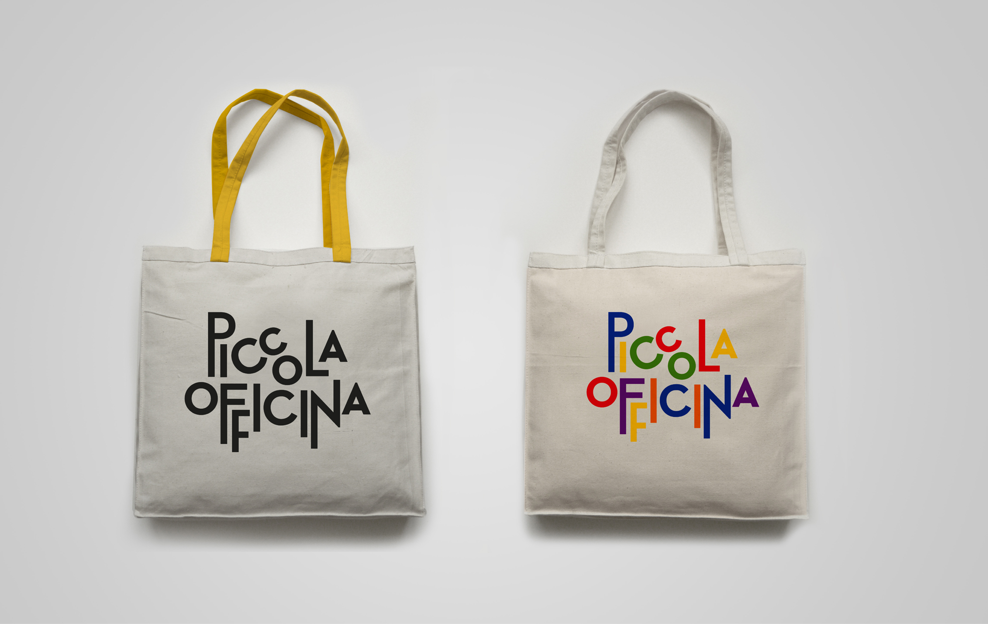
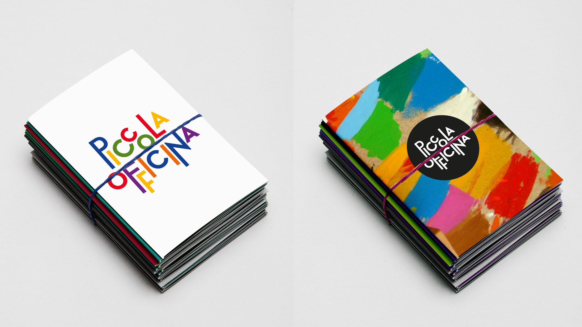
Given the cheerful nature of the topic, color played a central role in the design.
The font, overall shape, and scale of the letters were carefully chosen to reflect the playful spirit of the brand. A monochrome version of the logotype was also developed for use when placed over images, ensuring versatility across different applications.